Size
512x512 if you’re in any doubt. 256x256 only if you know what you’re doing.
Every objective in a goal set needs an icon. Players read a board by its images, usually at a glance and often on a small screen, so icon quality has a real effect on how a game plays.
Size
512x512 if you’re in any doubt. 256x256 only if you know what you’re doing.
Format
PNG or WEBP. Never JPEG.
Spacing
Transparent background, with a clear margin. The artwork must not fill the whole square.
Naming
game/short_name.webp, lowercase, no spaces, descriptive.
Sharpness
Start from the best source you can find. Don’t stretch a small image up to hit a size.
Consistency
Every icon in a set should look like it belongs to the same set.
Ownership
Your own work only. Never someone else’s art.
Icons must be exactly 256x256 or 512x512, and sharp at that size.
| Size | When to use it |
|---|---|
| 512x512 | The default. Use this if you’re in any doubt. |
| 256x256 | Only if you know what you’re doing and the icon is sharp at that size. |
PNG and WEBP are both fine. Use whichever your editor exports most easily. Avoid JPEG.
Icons should have a transparent background rather than a white or coloured one. Both PNG and WEBP support transparency, and the transparent area matters. See Spacing.
Every icon in a set should share the same prefix, so a game’s icons stay grouped together. For Super Mario Odyssey, all icons would sit under smo/:
smo/collect_moons.webpsmo/get_outfits.webpsmo/checkpoints.webpNames should be short but descriptive so they’re searchable, all lowercase, with no spaces or special characters:
smo/final_boss_no_damage.webpsmo/purple_coins_sand.webpsmo/capture_gushen.webpsmo/Icon 1 (final).webpsmo/goal_47.webpsmo/image_copy_2.webpIcons are attached to objectives in the editor. In the icon section of a goal, click + Add Blank, then click the icon it adds to rename it.
Once they’re all assigned, run the Image Validator. You select your image files and it compares them against the goal set, checking for:
Every icon must be your own work. You make it yourself, either from scratch or by using and modifying existing “fair use” game assets such as official sprites, models, renders or screenshots.
Icons are not made for you, and a goal set without a complete set of images can’t be added to the site.
The image below shows how the space in an icon is used. The artwork sits inside a main icon area with a clear margin around it, and the corners are reserved.
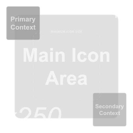
Image by
Ike Design
An icon is not a tile. When a goal is completed the cell is filled with the colour of the player who claimed it, and that colour needs to be visible around the artwork. If the artwork runs to the edges there’s nowhere for the colour to show, and the board becomes hard to read at a glance.
Parts of every icon are covered during a game, so keep those areas clear. Avoid placing anything important in the:
The top left is usually a good place to indicate anything specific or unique for similar goals, e.g. Collect 10 outfits might use a top left icon for the location.
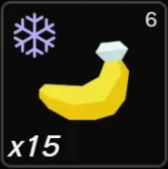
This is 15 unique bananas in Freezer layer:
15 is shown in the bottom left6 is shown in the top rightWhen you change an image’s size, your editor has to create pixels that weren’t there or discard pixels that were. The resample setting (sometimes called interpolation) controls how it does that. It’s usually a dropdown next to the width and height boxes in your editor’s resize dialog.
Using the wrong one is a common cause of blurry icons.
| Your image | Resample setting |
|---|---|
| Pixel art, or anything blocky and hard edged | Nearest Neighbour |
| Scaling up by a whole number (2x, 3x, 4x) | Try Nearest Neighbour first, then Bilinear |
| Everything else | Bilinear or Bicubic |
Nearest Neighbour copies pixels instead of blending them, so hard edges stay hard. On smooth artwork it produces jagged, stair-stepped edges. On pixel art, anything else turns crisp blocks into mush.
Bilinear and Bicubic blend neighbouring pixels together, which is what you want for smooth artwork, logos, renders and photos.
The names vary between editors. Nearest Neighbour may be listed as Nearest, None or Pixel Art, and Bicubic may be listed as Smooth, Cubic or Lanczos (Lanczos is fine).
If the artwork you have is smaller or lower quality than you need, work down this list in order.
Find a better source
This is usually the best option and only costs time. Look for a higher resolution version: game files, a wiki, an official render, a promotional asset, or retaking a screenshot at a higher resolution.
If it’s pixel art, just resize it
Pixel art doesn’t need upscaling. Resize it with Nearest Neighbour, ideally by a whole number like 2x or 4x, and it will stay sharp. Running pixel art through an AI upscaler will ruin it.
Make the icon yourself
If there’s no good source to be found, draw or build one. An icon you made that’s clear and sharp beats a scraped image that’s blurry, and it will always pass review where the blurry one won’t.
As a last resort, use an upscaler
Only worth trying when you have artwork that’s genuinely close to good enough. Upscayl is free and runs on Windows, macOS and Linux.
Digital Art and High Fidelity models and keep whichever looks better. Neither is better in every case.After upscaling, you may then need to clean up the image to remove any artifacts or noise that the upscaler introduced.
If you don’t have an editor, Affinity is a reasonable option. It’s free, runs on Windows and macOS, and covers everything described here. This is not an endorsement of Affinity, it’s just a reasonable option.
Collect 100 Coins, don’t place the text 100 over an image of the coins. This restricts any future changes or re-use of the image, i.e. it’s later changed to Collect 150 Coins. The site can show values for you.Every objective has an icon, every icon is unique, and every icon is entirely your own work
Every icon is exactly 256x256 or 512x512, and sharp at that size
Everything is PNG or WEBP, nothing passed through JPEG
Backgrounds are transparent
The artwork has a clear margin around it and doesn’t fill the whole square
Nothing important sits in the top right or bottom left
Filenames are lowercase, prefixed with your game, and descriptive
The correct icon is set on each goal in the game data
The Image Validator shows no missing images, case mismatches or missing category prefixes
Viewed together, the icons look like one set
Once that’s all done, see Submitting a Game for the rest of the process.